
The iceberg of science
Have you ever heard of the iceberg metaphor? The distinction between what people see and what they do not? If you have not, check out the image below:
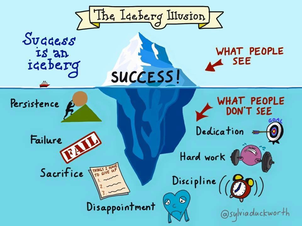 Courtesy of St. Fergus’ National School
The image is pretty self-explanatory for the most part: the process that contributes to the final product is either obscured or eclipsed altogether. This can lead to a lot of warped perceptions about what it takes to accomplish a deliverable — whether it is an academic paper, an exam grade, or, in my particular case, the presentation of a paper.
Recently, I finalized the slides for a presentation I am delivering for my Developmental Cognitive Neuroscience course on one of my favorite papers. I was particularly proud of this presentation not because it came out nicely (even though it did, if I do say so myself), but mainly because I spent a lot of time on it — A. LOT. OF. TIME. So I wanted to spend even more time detailing what the process was and why it was so meaningful to me.
First, the emotional: in a rare moment of public vulnerability, you can see some of my presentations as an undergrad HERE and HERE. These were presentations I gave my sophomore and junior year, respectively (basically 4-5 years ago at this point). Not my best work — and I do not think they are bad — but it was certainly not my most thoughtful products either. To me, these indicate a lack of effort made to ensure my audience understood the significance of the paper. Meaning I did not take the time to make sure I fully grasped the paper to deliver a high-quality presentation to give the author’s work justice. And, to provide grace to myself, I had not developed the skills to figure that out — but it was an important goal of myself then that I did not prioritize.
However, so much has changed over time — including my commitment to the goals I set out for myself in science. One of those goals is to ensure that I take the time to comprehend a paper in its entirety to translate this work to a broader audience (i.e., someone with no training in neuroscience whatsoever). Another is to incrementally showcase more challenging, complex papers. That’s why Dr. Jesse Gomez’s 2019 Pokemon paper was ideal: it is a paper that I love and many of the methods are beyond the scope of my current research projects (but methods I hope to learn in time!).
The first step I took was re-reading the paper. Whenever I read an empirical article, I start with the following:
- Abstract
- Introduction
- Figures
- Methods
- Discussion
- Results
While this order may not follow the presentation of the paper, the reason is because, as I read, I develop a list of questions I aimed to address in the following section. Here are some questions I had from each section as I was reading:
| Section | Questions |
|---|---|
| Abstract | What is eccentricity? |
| Introduction | What is eccentricity bias? What is rectilinearity? Animacy? Can I come up with examples of my own to explain this? |
| Figures | Figure 2: What is the y-axis saying in b,c, and d? What is the difference between b-d? Why only animals and Pokemon? What is the significance of Figure 4? |
| Methods | How is Jesse creating and analyzing each of the figures? What is neural decoding (and winner-takes-all classifier)? |
| Discussion | What — how did he show support for eccentricity??? |
| Results | Literally everything |
Next, as I develop a list of these questions, I then try to either a) find the answer within the paper or, if that does not work, b) Google + YouTube!
Indeed, I found much success in learning more about the paper through some videos on YouTube provided by M.I.T. For example, I viewed THIS website and watched THIS video by Dr. Rebecca Saxe to learn what was going on with Figure 2. This helped inspire including some slides of my own to explain these figures because I anticipated the class similarly needing some background to connect how these graphs build on Jesse’s primary argument. In essence, in order for me to present just one figure (out of 8), I spent a good hour and a half learning plus another thirty minutes designing the slides.
However, what happens when Google does not materialize the answer you’re looking for? (My answer? I cry).
This was a challenge I encountered when I googled “what is eccentricity bias?”. That’s because the primary results was either this paper or a short video posted by Stanford with Jesse talking about this paper. This prohibited me from fully explaining Figure 4 and thereby affecting understanding subsequent figures. Normally, at this point, I would find papers referenced that describe eccentricity bias (which are present in the article) and review those to seek clarity. However, instead, I tried something new.
I mentioned that not being able to explain Figure 4 meant I could not explain later figures — like Figure 5. So the next question I asked myself was simple: How are Figures 4 and 5 related? Reviewing Figure 5 made more sense to me so next I did some backtracking and asked a different question: How did Jesse construct each of the graphs in Figure 4?
Fortunately, this is another question whose answer laid within the paper — and what I realized was that Jesse had nicely laid out one of my favorite components in literally anything with theory: hypothetical graphs/illustrations. This motivated me to create visual illustrations of these to help the audience (but mostly myself) follow the logic of the authors to bridge Figures 4 and 5 (slides 62 - 73). And with that, I felt enough clarity was achieved that I could build out the rest of the presentation. (The rest of the time was just making it visually pleasing and building out an outline).
In total, I probably spent at least 8 hours on this presentation alone. Did I have to spend this much time on a paper? Will I always be able to devote this amount of energy to presenting a paper? Of course not — but if I must, I should know how to do so independently and comfortably.
What I have learned in creating this presentation that added to the significance was that I never dedicated this much time to challenging scientific articles — because I would give up. I would do the bare minimum or adjust my expectations or simply seek out an “easier” paper. It also highlighted the progress I have made — scientifically (like being able to learn complex cognitive neuroscience methods) and personally (like spending time developing my presentation and engagement skills).
The main takeway is that science/progress with anything takes time and effort. Even though I may not be proud of the quality of my work in the past, I can say for certain that 5 years from now, I will surely be proud of this one — and I am optimsitc of what more will be accomplished by then.
Leave a comment